W�e’re a strange bunch, and it’s because of this that brands have found it so hard to market to us. How can you expect to see results from a lovingly crafted, artistic marketing campaign on TV when the height of comedy for my age group is someone doing surgery on a grape?
There’s been plenty of examples over the years of brands trying to capitalise on our strange humour, ranging from the mildly successful to the downright embarrassing. Brands using memes in marketing seems to be one of the main offenders here. If you’re not familiar with memes, Google defines them as ‘an image, video, piece of text, etc., typically humorous in nature, that is copied and spread rapidly by Internet users, often with slight variations.’
My generation in particular (Gen Z, born from 1995 onwards) is often berated by the media for being glued to our phones. Whilst I disagree with this being true for every teenager, stereotypically it can be true for quite a few of us.
A lot of us adore social content, and would rather be on Netflix or YouTube than traditional TV channels. Memes in particular form a large part of the content of many social media platforms for my generation now, specifically Instagram, Reddit and Tumblr. Despite all this, a lot of brands seem to be missing the mark with their attempts at humorous marketing.
Here’s three of my favourite examples of corporate meme usage - good and bad - with some insights on how to use memes and modern humour to your brand’s advantage online.
Denny’s Twitter Account
The American diner Denny’s has found a unique niche on Twitter. Namely, it’s one of the weirdest corporate accounts out there - and people love it. In 2013, the brand’s social media was taken over by the EP+Co agency. They had one simple aim, which was to make the brand’s social media activity not sound like a corporate account.
Fast forward to 2018, the brand is infamous for its bizarre and occasionally disturbing breakfast-themed content on a number of platforms. They’re experts at hijacking popular trends and current news and popular culture events on Twitter, such as the removal of the iPhone headphone jack.
Such is Denny’s success that they have international followers from places that don’t even have one of these restaurants. Its Twitter account even helped kickstart a new meme format a while back, by hiding a message in a pancake.
Gucci Memes
Here’s a surprising one. Out of all the brands to use memes in marketing, would you expect a luxury, high-end retailer to get involved? Not many people did, which is why these were received with gleeful concern.
Gucci created #TFWGucci (That Feeling When Gucci) to promote its new line of watches. They commissioned a number of pieces of artwork, and then had popular meme creators make content with them. The results were fairly mixed.
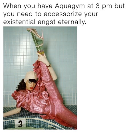
Some were pretty funny and went down well online, but others just seemed a bit odd and out of touch. Fashionista made some pretty good points in this article, mentioning how it’s strange for a large, established brand like Gucci to be making memes, as the origin of niche memes involved talking about topics like mental health - which were too taboo to talk about in mainstream media.
Overall, it was interesting but seemed a little bit out of character for such a high-status brand. To really appeal to the meme community, Gucci should have probably had a bit more existential dread
Wendy’s Memer Advert
This one is a little older, but it still makes my soul hurt.
When it first came out, it had people debating whether this was deliberately meant to be so terrible, in order to create hype online.
Anyone who’s been vaguely aware of memes for the last few years or so will see the glaring issues with this advert.
It’s just cringey. Plain and simple. There’s no punchline, there’s not even really an element of self-awareness – which is one of the elements that memes are normally recognised for.
This meme format with the bold white text and ‘like a boss’ arguably hasn’t been funny for a good ten years or so. It’s completely out of date, which defeats the objective of using memes (they’re topical and based heavily around online trends).
Regardless of whether this was genuine, self-aware or an attempt at possibly creating nostalgia for meme fans, I don’t think it worked very well. It left many online viewers feeling irritated and enraged by how out of touch it was.
If the point of the advert was to get people talking about the brand (and how out of date it was), then fair play. But if the point was to make sales, I don’t think this was the best strategy as many seemed more annoyed with the brand than engaged with it.
There’s even a Reddit thread dedicated to this sort of mishap, called r/CorporateFacepalm. It’s worth checking out before you try any sort of memes out yourself – or if you just want a laugh.
There’s plenty more examples of corporate memes dotted all over the internet - some mildly funny, others just simply embarrassing.
In all seriousness though, creating memes can be a dangerous game to play when using them for advertising or marketing a brand. For example, memes can have hidden meanings or symbolisms that will be understood by people active on particular parts of social media, but skate right over the heads of corporate teams.
Pepe the frog, for example, was a very popular meme a while back.

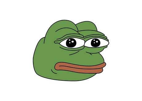
Pepe was widely used by the media and political campaigns until he was found to have associations with the alt-right. Pepe never originally had racist associations, but it was hijacked by certain groups of people to suit their own causes.
By the time Pepe was used in the 2016 United States presidential election campaign, he had already been branded a hate symbol. He’s now in the Anti-Defamation League’s guide to hate symbols, much to the amusement of some parts of the internet.
This happens fairly frequently, and unless you have someone working for you who spends the majority of their time looking at memes, you might accidentally post something that has horrible hidden messages associated with it. It’s a big risk to take, especially for large or well-established brands.
Another negative to using memes is how quickly they age. As I was researching for this blog, I came across a bunch of meme adverts from around 2012-2015. This article from Digiday has some good examples of what I mean- specifically, the Virgin Media one. My first reaction was that they were terrible, simply because of how outdated they automatically seemed to me.
Thinking about it, it’s quite likely that these campaigns would have been funny when the memes were on trend. They fit the meme well, and they’re not too awkward. But they seem so bad to us now because of how old the format is.
Meme trends change so quickly and so do reactions to them. In the time that it’s taken me to write this blog and get it through the editing/approval process, the ‘doing surgery on a grape’ meme I referenced in the opening paragraphs has already gone out of date and is now considered to not be funny.
If your brand is modern and has a fairly young audience, it can be a highly effective marketing strategy to use memes and edgy jokes in your content. If not, your audience may be confused by your attempt at being trendy. Bear in mind your target market, especially if you’re attempting dark humour with your campaigns.
And steer clear of using memes unless you’re absolutely certain that your audience will enjoy them, and that you understand the meme properly. It’s not worth the effort if your campaign is just going to end up being mocked on a Reddit thread.
At Thirty Seven, we offer content and design services to ensure your campaigns reach the right audiences at the right times. Our journalist led approach ensures your content is interesting, engaging and informative so you gain brand awareness and engagement whether it is social media content or an eBook.