A big budget helps, great ideas are critical, but as some of the below companies found out some elements are simply outside of your control and can sometimes cause campaigns to go viral for all the wrong reasons…
Walkers Wave
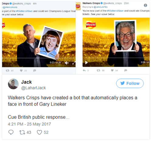
In this campaign, fans were asked to tweet their selfies so they could feature in a short video clip in which Gary Lineker held a picture of their selfie and said “Thanks for joining the Walkers Wave and celebrating the UEFA Champions League Final.”
However, this backfired and went viral in a way Walkers probably wished it hadn’t.
The crisp producer set up an automated tweet system meaning all images were automatically submitted to show in the picture frame.
But, there was seemingly no screening or filtration process.
This meant that when members of the public started to tweet in images of people who are famous for committing crimes, the campaign quickly started to go downhill.
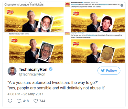
The campaign’s failure soon spread like wildfire through the Twittersphere and other media platforms due to the ease of sharing posts.
You can tell Walkers had good intentions and hoped the campaign would be original, convey emotions, spark interest and be easy to share.
Like any great campaign it did do this, just not in the intended way.
Pepsi’s advert featuring Kendall Jenner
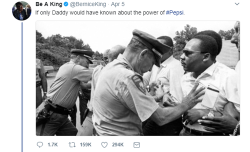
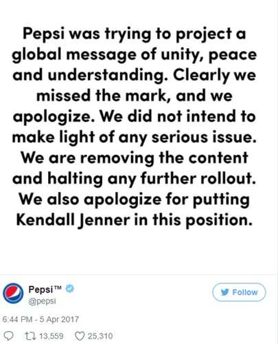
Pepsi faced huge backlash to an advert featuring Kendall Jenner where she was seen giving police a can of Pepsi on the front line of a protest.
The advert was meant to portray a message of peace, unity and understanding but instead was criticised for trivialising social justice demonstrations.
In the advert Kendall is seen giving a police officer a can of Pepsi, he then smiles at a fellow officer as protestors cheered.
Backlash from the advert suggested that if protestors were kinder and gave police a drink, there would be no need for social justice demonstrations.
The public mocked the campaign with key influencers like Bernice King, Martin Luther King Jr’s daughter, tweeting a picture of her father with the caption:
Pepsi’s hope of creating a campaign relating to current political events obviously fell flat. It initially defended the advert saying it “reflects people from all walks of life coming together in a spirit of harmony”.
However, the backlash continued to grow, and Jenner also faced criticisms with Eric Thomas, senior partner of Saga marketing posting on LinkedIn that “A Caucasian, blonde, classically beautiful, affluent, kid born into celebrity probably isn’t the person you need to represent struggle and civil unrest”.
Pepsi finally withdrew the advert and apologised with the following statement:
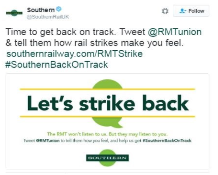
Southern Rail – Let’s Strike Back
It’s not just food and drink based campaigns that can go wrong as Southern Rail found out when its Twitter campaign was derailed.
The company’s campaign asked its customers to challenge a Rail, Maritime and Transport Union (RMT) strike on Twitter.
With the headline ‘Let’s Strike Back’, the company’s initial tweet asked customers to tell the union how the rail strikes make them feel with the hashtag #SouthernBackOnTrack
But perhaps not surprisingly given the operators reputation for late, cancelled and over-crowded trains, customers used the hashtag to lambast its service.
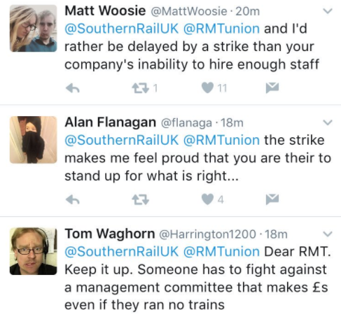
Quickly, Southern Rail lost control of the campaign with the public creating their own, more popular hashtags including #SouthernFail.
Soon, national media picked up on the Twitter storm generating more unfavourable headlines and comments for the company.
The company initially refused to apologise for the campaign or the poor services customers had received, saying its ‘aim was to get the debate going’.
However, a month later the deputy chief operating officer of Govia Thamesline Railway, the parent company of Southern Rail, said the tweets were a “mistake.”
It’s clear to see there was little debate around the topic but more a way of customers to vent their disappointment and even anger at the brand.
Amazon: The Man in the High Castle
Back in 2015, Amazon’s new show ‘The Man in the High Castle’ depicted a dystopian life in which Nazi Germany and Japan have control over the US after winning World War Two.
To promote the show, Amazon decided to advertise across New York City.
The company wrapped the subway seats, walls and ceilings of one train in a version of the American flag, replacing the stars with a German eagle and iron cross. They even created a stylised flag for the ‘new Japan’.
The campaign also involved having 260 posters across the subway station.
The advertisements were due to run for 2-3 weeks until early December but were pulled hours after New York Mayor Bill de Blasio called Amazon to do so.
Bill de Blasio stated that the advertisements were “irresponsible and offensive to Word War II and Holocaust survivors, their families, and countless other New Yorkers”.
The lesson learnt: Historical events are still sensitive even in a dystopian world.
Coca-Cola – GIF the Feeling
When Coca-Cola changed its tagline from ‘Open Happiness’ to ‘Taste the Feeling’, it decided to celebrate the launch with the campaign ‘GIF the Feeling’.
The idea was that the public would be able to superimpose their sentiments on a pre-created GIF.
Coca-Cola was smart and had thousands of words filtered so they couldn’t be included in the campaign including hell, fat, homosexuality, diabetes, all swear words, business, sex, drugs and more.
However the public, as menacing as they are, decided to get creative and create GIFs with the words which had not been filtered, including diarrhoea, capitalism, Benghazi and more.
It was soon clear to see Coca-Cola had lost control and the public had hijacked the campaign.
In a statement, Coca-Cola said: “Our intention was to invite consumers to share their feelings in a positive and uplifting way as they discover our new campaign. It is unfortunate that some people have chosen to use our campaign materials to do just the opposite” … “Their comments do not reflect the views of The Coca-Cola Company”.
Protein World - Beach Body Ready
The supplement company’s weight loss advert featured a model in a bikini with the phrase ‘Are you beach body ready?’
It was displayed all over the UK and faced huge backlash for ‘body shaming’.
Watchdog reported the campaign received almost 400 complaints. Additionally, a protest was held in London’s Hyde Park and a Change.org petition gained more than 70,000 signatures.
The Advertising Standards Authority (ASA) stated it had received a range of complaints on issues including the ‘very slim, toned’ model which suggested that all other body shapes are inferior.
Protein World remained defensive and unapologetic during the backlash. It even invited the public to consider if they were in the shape they wanted to be and claimed that the campaign doesn’t imply everyone should look like the model.
After much debate over the wording the ASA initially deemed the advert did not breach any UK advertising rules relating to harm and offence or responsible advertising.
Many of the public were upset with this result and continued to campaign against the ‘beach body’ image.
However, after some further consideration ASA decided to ban the advert and ordered it to be removed.
Protein World continued to advertise with similar campaigns like ‘Think Small’.
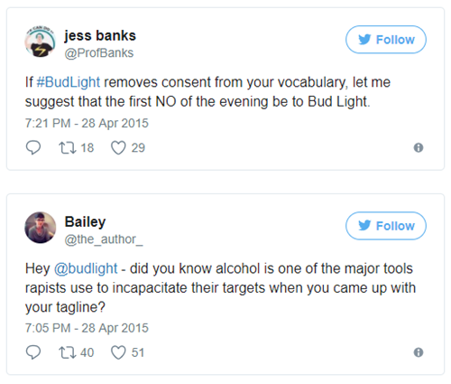
Bud Light – Up For Whatever
In an effort to get everyone together for a good time, Budweiser launched its campaign ‘Up For Whatever’.
The beer company produced bottles with the following line printed on them, “The perfect beer for removing ‘No’ from your vocabulary for the night’.
This led to heavy criticism on social media with critics claiming it undermined the anti-rape “no means no” campaign in an effort to stop sexual assault.
It upset many consumers who claimed the beer’s messaging didn’t recognise that alcohol frequently plays a part in rape cases.
The initial release of the new bottles was supposedly designed to ‘inspire spontaneous fun’.
Soon after, Budweiser admitted it had ‘missed the mark’. It said: “We would never condone disrespectful or irresponsible behaviour”.
However, a longer statement was issued by owner Alexander Lambrecht who said: “The Bud Up For Whatever campaign, now in its second year, has inspired millions of consumers to engage with our brand in a positive and light-hearted way. In the spirit, we created more than 140 different scroll messages intended to encourage spontaneous fun. It’s clear that this message missed the mark, and we regret it.”
While all these campaigns certainly succeeded in becoming part of the conversation, it came at the cost of damage to the reputation of the brands involved. And they show how a few simple errors, or a poorly thought out idea, can quickly turn something with good intentions into something hugely negative. Going viral is clearly not always a good thing.
At Thirty Seven, we offer content marketing services and ensure your campaigns reach the right audiences at the right times. Our journalist led approach ensures our content is interesting, engaging and informative so you gain brand awareness and engagement for all the right reasons.